On one of my journeys throught the winding internet I found the design firm of
Carter and Company. Their portfolio is amazing. I like how they have combined traditional elements with pops of colour for a younger more fresh look. The painted china cabinet is a good example of how they have successfully breathed new life into a very formal piece. I also like how they have displayed the blue and white china inside; very graphic and minimal.
This bathroom is great. Love the classic tile, nickle finishes and bits of black.
This kitchen encorporates my love of subway tile, herb topiaries, Emma Bridgewater china, black and white floors and art in the kitchen. Wow.
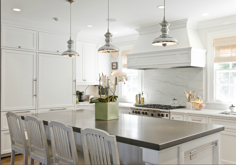
Another great kitchen, simple and timeless. I like a large island without a sink.
This is going in my girl room/mom cave file. Love it.
Hope you are having a good day!


No comments:
Post a Comment
Please feel free to leave a message. I would LOVE to hear from you. Thanks for reading.